


Advanced Analytics
1. Viewing Behavior Analysis
Viewing behavior analysis, based on Polyv big data, displays how viewers watch your videos with second-level granularity.
A video viewing heatmap is a graphical representation of a single viewing session. Each playback of a Polyv cloud video generates a heatmap. This is a powerful tool because heatmaps not only show statistical results like viewing completion rates but also intuitively recreate the entire viewing process. They help you gain a more comprehensive and in-depth understanding of your audience and their varying preferences for video content, thereby unlocking greater data value and supporting better business operations.
Heatmap Example:
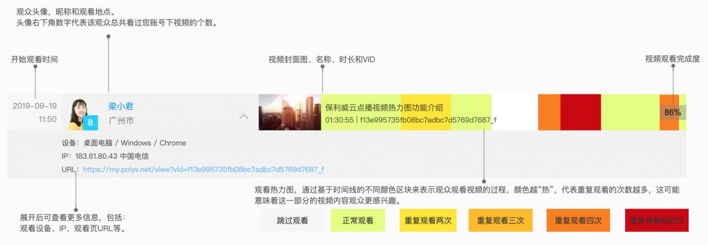
The video viewing heatmap includes viewer information, device environment details (video playback time, location, device, etc.), and color blocks along a timeline.
The time on the far left of the heatmap indicates when the video started playing.
Next is viewer information, including the viewer's avatar, the total number of videos they have watched under your account, their nickname, and viewing location. Clicking the avatar or nickname navigates to the viewer analysis page.
Note: The prerequisite for displaying viewer avatars and nicknames in the heatmap is passing viewer information to the player (see Viewer Information Settings and Statistics). If no avatar information is passed, the avatar will be replaced by a blue square. If no nickname is passed, the nickname will be replaced by the viewer ID. If neither the viewer ID nor nickname is available, the avatar will be a gray square, and the nickname will default to "Guest."
Click the expand button to the right of the viewer nickname to view more information, including:
- Viewing device information: device type (including desktop and mobile devices), operating system, browser type.
- Viewing IP and network operator information.
- URL of the viewing page.
Video information includes the video cover image, video name, video duration, and video ID.
The viewing heatmap uses different color blocks along a timeline to represent the viewer's process. The "hotter" the color, the more times that section was rewatched, potentially indicating greater viewer interest in that part of the video.
- White blocks indicate the viewer skipped that section of the video without watching.
- Green blocks indicate the viewer watched that section normally.
- Yellow blocks indicate that section was rewatched twice.
- Orange, red, and dark red blocks indicate the section was rewatched three, four, or more than four times, respectively.
2. Video Analysis
Heatmaps show how individual viewers watch your video, while video analysis charts let you understand how the entire audience engages with it.
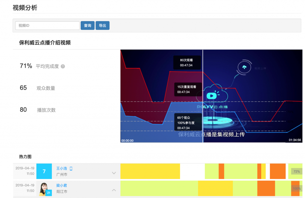
The red line indicates the number of times the video content at a specific timestamp was watched. The blue line indicates the number of viewers who watched the video content at that timestamp. Thus, the blue area in the video analysis chart represents overall audience engagement, while the red area represents the number of rewatches for that portion of the content. Hovering over the chart displays the frame at that timestamp along with corresponding viewing statistics (number of viewers, viewer engagement, and rewatch count).
With the video analysis chart, you can see which parts of the video were rewatched multiple times and which parts were skipped. For example, a drop in the line may indicate waning viewer interest in that section, while a rise may suggest that section captured viewer attention. This information helps you optimize video content and provides guidance for creating more engaging videos in the future.
The left side of the chart displays key metrics for overall video playback, giving you a macro-level view of the video's performance to date. The formula for average completion rate is: Average Completion Rate = Total Actual Playback Duration / (Total Plays × Video Duration). The average completion rate represents the percentage of the video duration that was watched on average per session. A higher completion rate indicates greater viewer interest in the video.
Note: Different types of videos should use different benchmarks for the average completion rate. Based on experience, help center videos typically have an average completion rate of around 50%, as viewers leave once they find the information they need. For product introduction videos on a homepage, a completion rate above 70% is considered healthy. If you find several videos with very high completion rates, be sure to analyze the reasons and take corresponding actions.
3. Viewer Analysis
Your viewers are not just a single metric representing user count; they are individuals. Viewer analysis allows you to gain a more comprehensive understanding of each user.

In the viewer list, you can see the total number of videos each viewer has watched and their first viewing date.
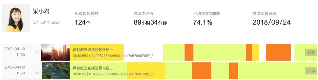 Each viewer has a dedicated page where you can quickly view their overall statistics, including:
- Total number of videos watched
- Total time spent watching videos
- Average viewing completion rate
- First viewing date
The viewer's video viewing heatmap allows you to gain insights into each of their viewing sessions, helping you better understand your audience.
4. Notes
- The statistics in Advanced Analytics are updated daily, meaning you can view yesterday's data today.
- This feature is a paid service and requires contacting your account manager to activate it.
- Due to the large volume of platform data, statistical analysis is only supported for playback data generated after activation. Historical data is not included.
